I have wanted to create a visualization of some of my travels for a long time but always got stuck procrastinating the details: Which arbitrary geographical divisions to use? Countries? Cities? Do transfer airports count?
This random Reddit post1 gave me the motivation to finally do something. Following the example of the Redditor who posted this, I used mapchart.net to color-code the counties2 of the US according to whether I had been there.
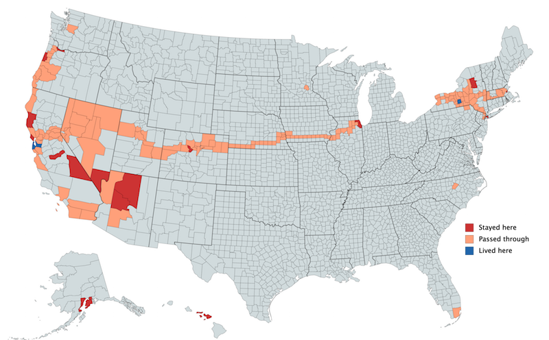
Here’s my US Travel Map as of March 2019:

United States counties I have lived in (blue), stayed overnight in (red), and passed through (orange).
The best part of travel, to me anyway, are the memories that I get from it. The few hours it took to research past trips in order to create this map were a great opportunity to recall those, from the crowded bus rides between Ithaca and New York City to the amazing thunderstorms we saw from our Amtrak bunk bed near Omaha. While I don’t remember every US county I passed through (sorry, Lincoln County Oregon and Kearney County NE), I could tell you a story about the journey that brought me there and the day of for each and every one.
It seems sensible then to add color to a few more of those outlines on the map! Thanks to the decision-making help of seven anonymous Twitter followers I am right now planning a road trip from Cleveland to Nashville (directly following PyCon which is held in Cleveland this year). Send me an email or a tweet if you have recommendations for which route to take and where to stop along the way!
r/Travelmaps is an entire sub-Reddit dedicated to travel maps like this one. ↩︎
Using counties as sub-division results in a few interesting artifacts like checking off almost half of Nevada on a single train ride across the state. A few counties are included because a road dips into it for a mile or so. Islands on the map are big hub airports that I have passed through: Miami, Charlotte, Seattle, etc. ↩︎